 06-15-2025, 02:17 AM
|
#15
|
|
Hall Of Famer
Join Date: Jul 2015
Location: Parts unknown
Posts: 9,038
|
City Connect Jersey Power Rankings
I like a team to look like themselves. That largely influences my opinion.
THE UGLY
Orioles
 Plus
At least they didn't try to incorporate the state flag somewhere like Maryland teams usually do.
Minus
Plain black and white w/trim from your mom's housecoat. NO.
Reds
Plus
At least they didn't try to incorporate the state flag somewhere like Maryland teams usually do.
Minus
Plain black and white w/trim from your mom's housecoat. NO.
Reds
 Plus
The "C" logo on the cap is different.
Minus
You can't read the team name in front. Course, if I was wearing this, I wouldn't want anyone to know who I was either.
Padres
Plus
The "C" logo on the cap is different.
Minus
You can't read the team name in front. Course, if I was wearing this, I wouldn't want anyone to know who I was either.
Padres
 Plus
At least they kept the majority of the uniform white.
Minus
What are all these eye sore colors? Pink, some kind of green, and yellow? They look like they could cause epileptic seizures. I'm in the minority that likes San Diego's team colors. It is a disappointment when these uniforms are on the screen.
Red Sox
Plus
At least they kept the majority of the uniform white.
Minus
What are all these eye sore colors? Pink, some kind of green, and yellow? They look like they could cause epileptic seizures. I'm in the minority that likes San Diego's team colors. It is a disappointment when these uniforms are on the screen.
Red Sox
 Plus
I get the Green Monster thing. So huge, I mean HUGE, baseball fan might dig the reference.
Minus
They are the color of the Green Monster.
Plus
I get the Green Monster thing. So huge, I mean HUGE, baseball fan might dig the reference.
Minus
They are the color of the Green Monster. Do we really need to dress like it? And after all, these are the RED Sox.
Rockies
 Plus
Logo ain't bad even though the colors are hideous.
Minus
Anyone know what they were going for here? Who was in the focus group that made the team green light these? They look like something Hollywood would design to imagine baseball on a Star Trek episode.
Guardians
Plus
Logo ain't bad even though the colors are hideous.
Minus
Anyone know what they were going for here? Who was in the focus group that made the team green light these? They look like something Hollywood would design to imagine baseball on a Star Trek episode.
Guardians
 Plus
They aren't see through.
Minus
I'd replace the "CLE" w/ "WHY". If this is all the imagination you can muster, why bother w/ doing it? I can't imagine these actually sell.
White Sox
Plus
They aren't see through.
Minus
I'd replace the "CLE" w/ "WHY". If this is all the imagination you can muster, why bother w/ doing it? I can't imagine these actually sell.
White Sox
/cdn.vox-cdn.com/uploads/chorus_asset/file/22546243/Yoa_n_Moncada_Lucas_Giolito_Tim_Anderson_City_Connect_Jerseys_2021.jpeg) Plus
At least the colors match the regular team jerseys.
Minus
The gothic font brings to mind the Adams family. I'm expecting Gomez to be the manager.
The BAD
Nationals
Plus
At least the colors match the regular team jerseys.
Minus
The gothic font brings to mind the Adams family. I'm expecting Gomez to be the manager.
The BAD
Nationals
 Plus
Can't say they are ugly.
Minus
Lot of "meh" here. Cherry blossoms are too prominent & better suited as a smaller logo on the cap or a patch on the shoulder.
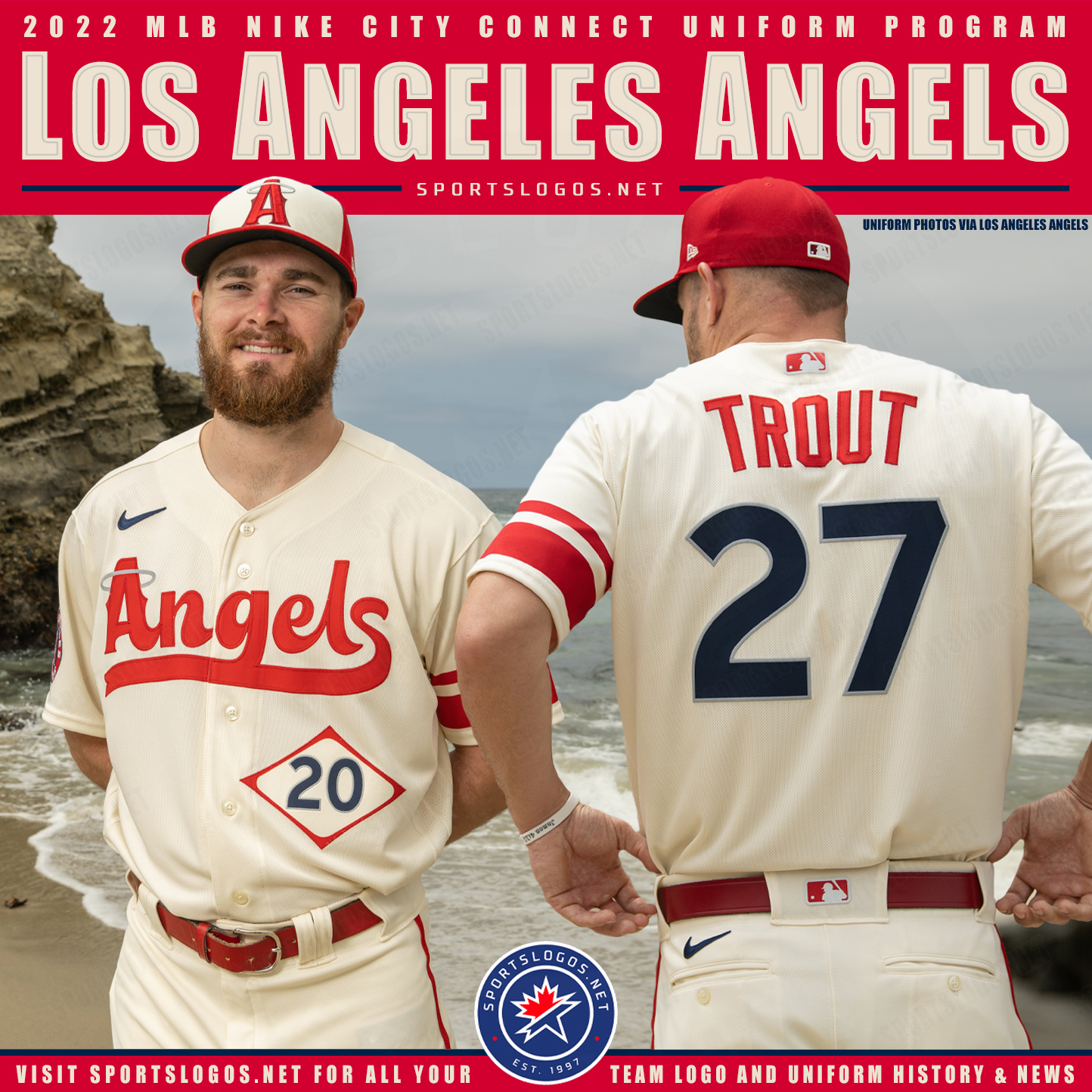
Angels
Plus
Can't say they are ugly.
Minus
Lot of "meh" here. Cherry blossoms are too prominent & better suited as a smaller logo on the cap or a patch on the shoulder.
Angels
 Plus
Can't think of anything. If they were going for a 60's era expansion team look...success.
Minus
BORING. Barely looks like they tried. The jersey numbers inside the diamond looks like the placard info on an 18 wheeler.
Rangers
Plus
Can't think of anything. If they were going for a 60's era expansion team look...success.
Minus
BORING. Barely looks like they tried. The jersey numbers inside the diamond looks like the placard info on an 18 wheeler.
Rangers
 Plus
Looks like the designer of the Angels jersey at least tried to earn his pay on this one.
Minus
When I 1st saw these I thought a team from Japan was touring the USA. The black pants make the Rangers look like villains.
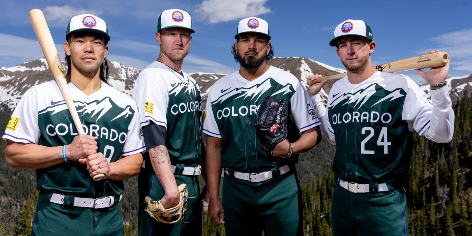
Rockies
Plus
Looks like the designer of the Angels jersey at least tried to earn his pay on this one.
Minus
When I 1st saw these I thought a team from Japan was touring the USA. The black pants make the Rangers look like villains.
Rockies
 Plus
A clean look. Creative w/o being too busy.
Minus
Despite the picture of the Rockies, does this look like THE Rockies?
Diamondbacks
Plus
A clean look. Creative w/o being too busy.
Minus
Despite the picture of the Rockies, does this look like THE Rockies?
Diamondbacks
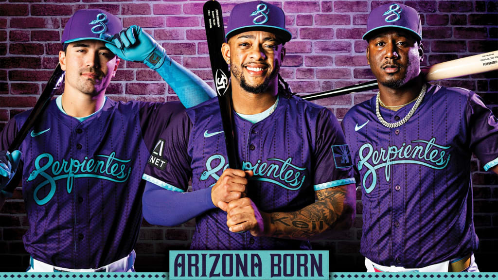 Plus
The "S"/snake logo on the hat is nice.
Minus
How many frkkin' uniforms does Arizona frikkin' have? Enough is enough. They change costumes like Liberace.
Mets
Plus
The "S"/snake logo on the hat is nice.
Minus
How many frkkin' uniforms does Arizona frikkin' have? Enough is enough. They change costumes like Liberace.
Mets
 Plus
These would make good alternates for the Yankees.
Minus
These aren't the Yankees, these are the METS!!! Tell me you are jealous of your big brother w/o saying it.
Marlins
Plus
These would make good alternates for the Yankees.
Minus
These aren't the Yankees, these are the METS!!! Tell me you are jealous of your big brother w/o saying it.
Marlins
 Plus
These aren't vomit-inducing but..........
Minus
......we've seen this before. Miami/Florida has had like 30 Miami Vice versions of their jerseys. It is like they are trying to distract us from the product on the field w/all their uniform changes. It doesn't say "this is special."
Blue Jays
Plus
These aren't vomit-inducing but..........
Minus
......we've seen this before. Miami/Florida has had like 30 Miami Vice versions of their jerseys. It is like they are trying to distract us from the product on the field w/all their uniform changes. It doesn't say "this is special."
Blue Jays
 Plus
Hey, look! Another black jersey! OK, that's not a plus. That's redundant. But I prefer these over the red shirts they wear on Canada Day. After all, they are the BLUE Jays!
Minus
From a distance, can you read the "Toronto" in front? How clear is the city skyline in the background from afar? If you aren't up close, the "city" looks more like a mistake at the print shop than a purposeful design.
White Sox
Plus
Hey, look! Another black jersey! OK, that's not a plus. That's redundant. But I prefer these over the red shirts they wear on Canada Day. After all, they are the BLUE Jays!
Minus
From a distance, can you read the "Toronto" in front? How clear is the city skyline in the background from afar? If you aren't up close, the "city" looks more like a mistake at the print shop than a purposeful design.
White Sox
 Plus
These actually don't look bad. Problem................
Minus
I think Chicago Bulls when I see them, even though it is obviously a baseball uniform. Not the Pale Hose. Guess that is good for Reinsdorf, but is that good for baseball?
Giants
Plus
These actually don't look bad. Problem................
Minus
I think Chicago Bulls when I see them, even though it is obviously a baseball uniform. Not the Pale Hose. Guess that is good for Reinsdorf, but is that good for baseball?
Giants
 Plus
Again not ugly.................
Minus
Again, another black alternate. Script lettering makes me think I'm about to watch Saturday morning cartoons. Or a Korean game show w/zero English captions.
Red Sox
Plus
Again not ugly.................
Minus
Again, another black alternate. Script lettering makes me think I'm about to watch Saturday morning cartoons. Or a Korean game show w/zero English captions.
Red Sox
/cdn.vox-cdn.com/uploads/chorus_asset/file/25641792/2148601542.jpg) Plus
IMO, these don't look bad.
Minus
What is the reason why we don't get the point of RED Sox? FLIPPIN' RED SOX??!!?
Plus
IMO, these don't look bad.
Minus
What is the reason why we don't get the point of RED Sox? FLIPPIN' RED SOX??!!? You're calling attention to the discrepancy by putting 2 logos on the yellow socks.
Brewers
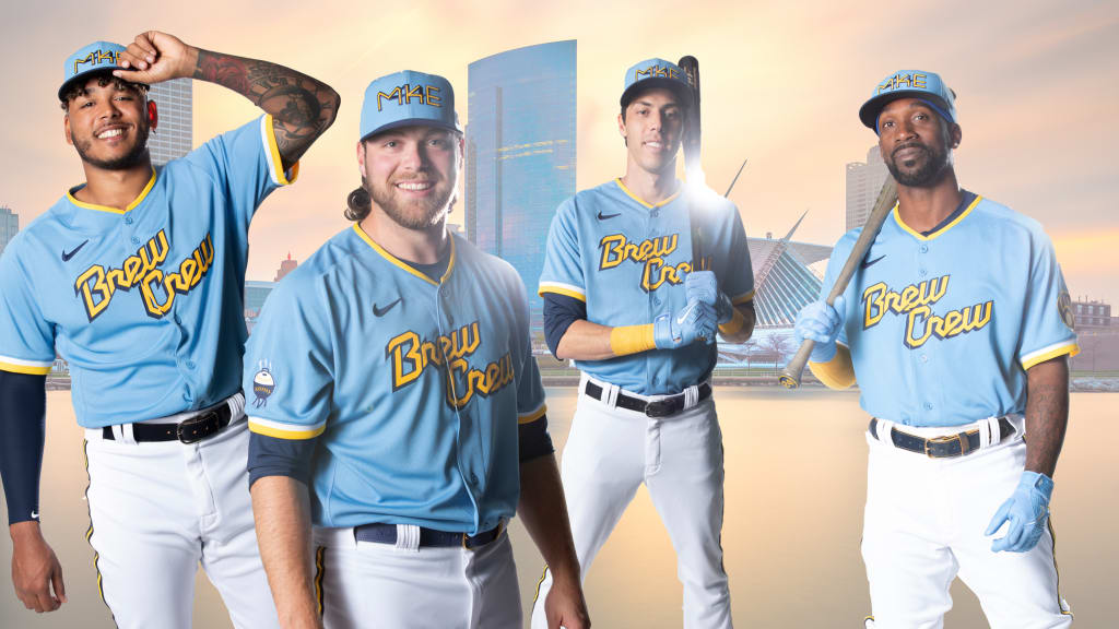 Plus
Love the colors
Minus
"Brew Crew" makes them look like your local rec league softball team sponsored by the town's beverage distributorship. And I demand any Brewer cap have the best logo in sports no matter what.
The GOODKeep in mind "good" is relative.
Nationals
Plus
Love the colors
Minus
"Brew Crew" makes them look like your local rec league softball team sponsored by the town's beverage distributorship. And I demand any Brewer cap have the best logo in sports no matter what.
The GOODKeep in mind "good" is relative.
Nationals
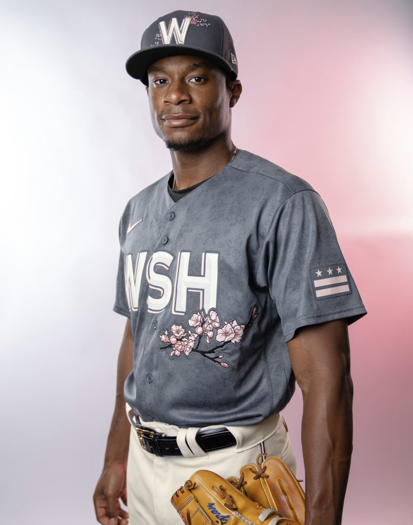
 Plus
Better than the "meh" originals. Better color, tiny cherry blossoms flanking the "W" w/the Capitol outline is nice detail and identifies the team. "DC" logo is less distracting than the huge "WSH".
Minus
The mosaic on the end of the sleeves is a detail I can do w/o. But at least it doesn't dominate the shirt. And the map of DC is unnecessary.
Tigers
Plus
Better than the "meh" originals. Better color, tiny cherry blossoms flanking the "W" w/the Capitol outline is nice detail and identifies the team. "DC" logo is less distracting than the huge "WSH".
Minus
The mosaic on the end of the sleeves is a detail I can do w/o. But at least it doesn't dominate the shirt. And the map of DC is unnecessary.
Tigers
 Plus
I know, I know. More black jerseys. At least Detroit wears black on the regular, so they earn a pass. And I've always liked matching blue w/black.
Minus
What about this says "Tigers"? I think when you sell merchandise, you want to advertise your team. Wear this outside of Detroit and who is going to think of your franchise?
Cubs
Plus
I know, I know. More black jerseys. At least Detroit wears black on the regular, so they earn a pass. And I've always liked matching blue w/black.
Minus
What about this says "Tigers"? I think when you sell merchandise, you want to advertise your team. Wear this outside of Detroit and who is going to think of your franchise?
Cubs
 Plus
I think these serve the team better than the Wrigleyville versions. The previous jersey is better for the locals. These are good for your national brand.
Minus
I'm too old. I think Expos when I see these.
Phillies
Plus
I think these serve the team better than the Wrigleyville versions. The previous jersey is better for the locals. These are good for your national brand.
Minus
I'm too old. I think Expos when I see these.
Phillies
/cdn.vox-cdn.com/uploads/chorus_asset/file/25374335/city_connect_graphic_1.jpg) Plus
I know traditionalists will hate these. But these grew on me.
Minus
The "Philly" font is hideous. Better suited for a horror movie poster. Ruins the look. But Philadelphia is an ugly city to me. So maybe it fits.
Dodgers
Plus
I know traditionalists will hate these. But these grew on me.
Minus
The "Philly" font is hideous. Better suited for a horror movie poster. Ruins the look. But Philadelphia is an ugly city to me. So maybe it fits.
Dodgers
 Plus
Different w/o going too crazy. You still feel like you are watching the Dodgers.
Minus
Not "finishing" the numbers on the back keeps this a double & not a homer. And what up wit dem socks?
Braves
Plus
Different w/o going too crazy. You still feel like you are watching the Dodgers.
Minus
Not "finishing" the numbers on the back keeps this a double & not a homer. And what up wit dem socks?
Braves
 Plus
Brings back fond memories of Hank Aaron, Dale Murphy & Bob Horner. New and somehow classic at the same time.
Minus
Isn't it "the ATL", not "the A"? A detail that wasn't needed & doesn't work.
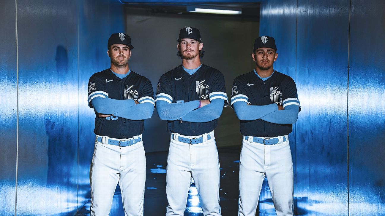
Royals
Plus
Brings back fond memories of Hank Aaron, Dale Murphy & Bob Horner. New and somehow classic at the same time.
Minus
Isn't it "the ATL", not "the A"? A detail that wasn't needed & doesn't work.
Royals
 Plus
You probably can tell blue is my fave color.
Minus
Logo looks like a tangle of paper clips. Jersey loses a lot if the light blue long sleeve isn't worn underneath.
Pirates
Plus
You probably can tell blue is my fave color.
Minus
Logo looks like a tangle of paper clips. Jersey loses a lot if the light blue long sleeve isn't worn underneath.
Pirates
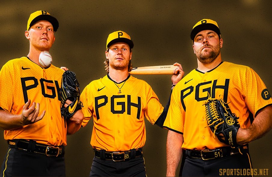 Plus
I've heard a lot of criticism for this one. I couldn't disagree more. These are great!!
Minus
The "PGH". Do people think "Pittsburgh" when they see those letters? Need something else up front. (Can someone tell me what happened to the bat in the above pic?)
Mariners
Plus
I've heard a lot of criticism for this one. I couldn't disagree more. These are great!!
Minus
The "PGH". Do people think "Pittsburgh" when they see those letters? Need something else up front. (Can someone tell me what happened to the bat in the above pic?)
Mariners
/cdn.vox-cdn.com/uploads/chorus_image/image/72852349/1689520281.0.jpg) Plus
Like the Braves, these manage to be new. Yet still appear vintage.
Minus
The black pants are a mismatch. When the whole thing is put together, it looks like someone dressed in the dark or skipped laundry day.
Astros
Plus
Like the Braves, these manage to be new. Yet still appear vintage.
Minus
The black pants are a mismatch. When the whole thing is put together, it looks like someone dressed in the dark or skipped laundry day.
Astros
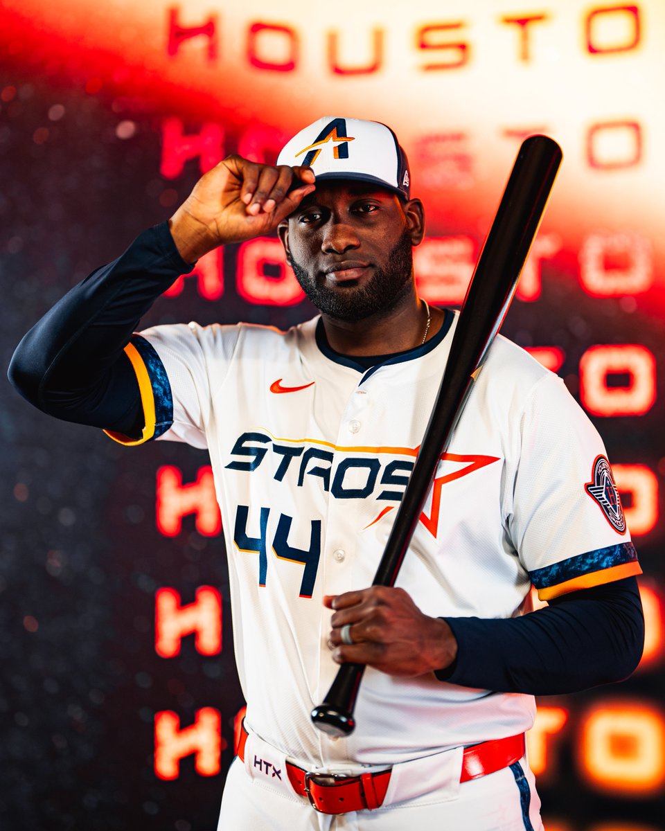 Plus
These need to be the regular threads yesterday. Homage to the rainbow jerseys w/out looking cheesy or gaudy.
Minus
Nothing. The font, logo on the cap, design, numbers to the right, the "story"......Everything works. Send that "Space City" shirt up in the next rocket.
Cardinals
Plus
These need to be the regular threads yesterday. Homage to the rainbow jerseys w/out looking cheesy or gaudy.
Minus
Nothing. The font, logo on the cap, design, numbers to the right, the "story"......Everything works. Send that "Space City" shirt up in the next rocket.
Cardinals
 Plus
They knew the assignment. They "connected" to the city. And they still look like the Cards. Work is done.
Minus
If I want to nitpick, the "STL" on the cap is too plain. Otherwise, no major mistakes here.
Plus
They knew the assignment. They "connected" to the city. And they still look like the Cards. Work is done.
Minus
If I want to nitpick, the "STL" on the cap is too plain. Otherwise, no major mistakes here.
__________________
If a man is guilty
4 what goes on inside of his mind,
then let me get the electric chair
4 all my future crimes.
- Prince
Batdance
June 7, 1958 - Apr 21, 2016
Don't fall for the spin
|

|

|