 |
|
Latest News:
OOTP 26 Available
- FHM 11 Available
- OOTP Go! Available
Out of the Park Baseball 26 Buy Now! |

|
|
||||
| ||||
|
|||||||
| OOTP 17 - General Discussions Everything about the latest Out of the Park Baseball - officially licensed by MLB.com and the MLBPA. |
 |
|
|
Thread Tools |
 03-18-2016, 04:23 PM
|
#1 |
|
Major Leagues
Join Date: May 2015
Posts: 303
|
Graph in the box score - what does it mean
Title says it all. I've never seen that graph before today. Can anyone tell
me what it means and why/how I can use it? I tried the manual, but there does not seem to be an online OOTP17 manual with the new features available. Thanks. Tim |

|

|
|
03-18-2016, 04:24 PM
|
#2 |
|
All Star Starter
Join Date: Nov 2010
Location: Danbury, CT
Posts: 1,635
|
Is that the WPA chart?
It shows the "momentum" swings, for lack of a better word. You can see specific plays which made/turned the game
__________________
It's amazing How you make your face just like a wall How you take your heart and turn it off How I turn my head and lose it all And it's unnerving How just one move puts me by myself There you go just trusting someone else Now I know I put us both through hell ~Matchbox 20, "Leave" Everyone knows it's spelled "TRAID", not trade |
|
|
|
|
03-18-2016, 04:40 PM
|
#3 |
|
Major Leagues
Join Date: May 2015
Posts: 303
|
I sim my games so how does it help me. There does not seem to be any documentation for it. A new feature should be defined.
My interpretation right now is that it shows the score flow, which is already available in the box score by inning. I must be missing something because the chart seems redundant. I found the option to turn it off, but before I do, I want to find out what it is trying to tell me. Thanks, Tim |
|
|
|
|
03-18-2016, 04:43 PM
|
#4 | |
|
Hall Of Famer
Join Date: Jul 2004
Location: Toronto ON by way of Glasgow UK
Posts: 15,629
|
Quote:
__________________
Cheers RichW If you�re looking for a good cause to donate money to please consider a Donation to Parkinson�s Canada. It may help me have a better future and if not me, someone else. Thanks. �Conservatism consists of exactly one proposition �There must be in-groups whom the law protects but does not bind, alongside out-groups whom the law binds but does not protect.� Frank Wilhoit |
|
|
|
|
|
03-18-2016, 04:53 PM
|
#5 |
|
Minors (Double A)
Join Date: Sep 2009
Posts: 148
|
It's a win probability graph, like this: Mets � Win Probability � Sunday, November 1, 2015 | FanGraphs Baseball
They've become popular in the last five years or so. Of course you could approximate it in your head by reading the line score but it's much easier to recognize swings in the game at a glance with a graph. Last edited by Ron.; 03-18-2016 at 04:59 PM. |
|
|
|
|
03-18-2016, 04:58 PM
|
#6 |
|
Major Leagues
Join Date: May 2015
Posts: 303
|
Thanks for the replies. I googled it and find myself more confused. Looks like this will be a feature I will be turning off. Why I need to know about this after a game does not help, especially since it does not indicate what caused the lines to go up or down. I already know my team won/lost so why do I need to know the probability of that occurring if I can't change it after the fact.
Tim |
|
|
|
|
03-18-2016, 05:03 PM
|
#7 |
|
Minors (Triple A)
Join Date: Oct 2014
Posts: 293
|
It's not really intended as a tool to 'help' you, it's more useful as a quick at-a-glance snapshot of how the game went.
Was it a close game, with lots of twists and turns, ending in a walk-off (indicated by a zig-zag up-and-down graph with a sharp tick in the final inning)? Or a pitchers duel where nobody got much offense until that home run in the 8th (a flatish line with a tick near the end)? Or did one team walk away with it in the early goings, but a grand slam brought the other team back into the game, but it wasn't quite enough (a line going towards the top or bottom for basically the whole game, until a sharp tick the other way, then back to the top/bottom again)? It's not a "useful" feature to help you win, as much as a nice aesthetic for some players. Yeah, you CAN look at the box score and get much the same information, but I quite like win probability graphs as a quick look at how it went overall. Last edited by monkeystyxx; 03-18-2016 at 05:05 PM. |
|
|
|
|
03-18-2016, 05:06 PM
|
#8 |
|
Minors (Double A)
Join Date: Sep 2009
Posts: 148
|
I mean reading the box score won't help you change anything after the fact either. The graph will label the biggest win probability shifts so you can see the big plays at a glance with having to go through the log. For example:
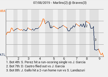 Here I can see very easily that Gallo's HR in the bottom of the 8th swung the game in my favor. |
|
|
|
|
03-18-2016, 06:19 PM
|
#9 |
|
Major Leagues
Join Date: May 2015
Posts: 303
|
Ron,
Maybe you can please help explain the chart more. What do the horizontal lines mean? What do the width of vertical white/grey bars mean? I figured out the numbers along the bottom are the innings and that white is for visitor, grey for home, or at least that is what it looks like it means. If you have a link to a site that explains the graph, I would appreciate the link. I followed baseball my whole life and keep score for little league. This is the first day I've ever seem the graph so I'm curious what it means and how it can be used. Thanks, Tim |
|
|
|
|
03-18-2016, 06:36 PM
|
#10 |
|
OOTP Developer
Join Date: Jun 2009
Location: Here and there
Posts: 15,473
|
Give or take, this is a good read on them: Win Expectancy | FanGraphs Sabermetrics Library
We obviously don't do things exactly the same way they do, but it gives an idea. In general: Home team on the bottom. Road team on top. The white and grey zones are half-innings. Every play is basically a short line on the graph. If the play increases the road team's chance of winning, the line goes up. If it increases the home team's chance of winning, it goes down. You hit the bottom at the end of the game, it means the home team won. You can basically think of it as a "play-by-play" view of who's winning. So in that chart above, you can see that before Gallo's HR (presumably a 2-run game with one guy on base), the road team had a ~60% chance of winning. After the homerun, the home team had a ~80% chance of winning. |
|
|
|
|
03-18-2016, 06:42 PM
|
#11 |
|
Major Leagues
Join Date: May 2015
Posts: 303
|
Matt,
Thanks for the link. I found that url when I googled and was more confused than I was before reading it so I decided to ask on the forum. I'll reread it again later and maybe it will start to make sense. Will the new "17" features be available in an updated online manual soon? Thanks, Tim |
|
|
|
|
03-18-2016, 07:45 PM
|
#12 |
|
Hall Of Famer
Join Date: Mar 2002
Location: In The Moment
Posts: 14,064
|
I love eyeballing the boxscore/chart back and forth and following the momentum changes in a game like this one that went back and forth.
Also like the fact that you can tell if an inning was quick or long by the width of the coloured bars. These are an excellent addition to the game. 
Last edited by Bluenoser; 03-18-2016 at 07:46 PM. |
|
|
|
|
03-18-2016, 09:26 PM
|
#13 | ||
|
Minors (Triple A)
Join Date: Oct 2014
Posts: 293
|
Quote:
Quote:
You can see that despite their lack of baserunners, Miami actually had the upper hand for most of the game, until Joey Gallo's 2-run shot in the 8th killed the game off and they never recovered. You can see at a glance that except for the 1st and 4th innings, Miami had very few baserunners, while Atlanta had several (the white columns are short, representing not many Marlins batters, and there isn't much orange on the graph representing Miami baserunners). I would imagine that Castro flied out with 2 on and 2 out in the bottom of the 7th. The two upwards spikes represent outs (making Miami more likely to win) and the two flat/slightly downward lines represent base runners for Atlanta (two singles, because a double would probably be a bigger downward slope). Then Castro flew out (the large upward spike annotated with the #2), swinging it further towards Miami as they get out of the jam. Miami on the other hand had 3 up and 3 down in the top of the 7th (the three orange lines all go downwards slightly, indicating that Atlanta benefited from it, meaning nobody got on base. The other clue is that there are only 3  ). ).You can tell quite a bit from these graphs, I think. That's why I like them. The box score for the 7th inning would just say: Miami: 0 Atlanta: 0 Nowhere near as fun.
Last edited by monkeystyxx; 03-18-2016 at 09:29 PM. |
||
|
|
|
|
03-19-2016, 03:52 AM
|
#14 |
|
Bat Boy
Join Date: Mar 2016
Posts: 8
|
Really love this feature, gives you a good opportunity to see which half inning had a big impact on your chances
|
|
|
|
|
06-30-2016, 03:49 PM
|
#15 |
|
Major Leagues
Join Date: Apr 2002
Location: Fort Worth, TX
Posts: 347
|
I think the WPA graph is useful for studying the effectiveness of relief pitchers. Who was on the mound when the game winning event occurs and how often does it happen? Do a lot of game changing events happen because of fielding mistakes? How many times does your slugger hit into a double play and change the direction of the game? Who got the strikeout with one out and the bases loaded? These events can be found quickly, and then analyzed. Imagine you are watching highlights on ESPN. The game changing events in the WPA graph are the highlights you will see on Baseball Tonight.
FWIW, I do not spend hours pouring over the WPA graphs, but if I actually manage the game I always look and see whether I made a managing error that might have cost me the game. The WPA is a valuable tool when it comes to discovering how and why a game is lost. If someone takes the time to follow game after game of these graphs, I think it is possible to determine whether you are losing games because of poor pitching, lousy fielding, or a lack of timely hitting. Examining the plays that either help win or lose a game is helpful and interesting to me. The WPA graph is just another tool to help understand how games are won and lost.
__________________
To laugh often and love much, to appreciate beauty, to find the best in others, to give one's self, this is to have succeeded. - Ralph Waldo Emerson |
|
|
|
|
06-30-2016, 05:06 PM
|
#16 | |
|
Hall Of Famer
Join Date: Apr 2015
Posts: 7,227
|
Quote:
it really can't help you at all. if you let up 2 runs in the top half of the first innings, you already know you are less likely to win - EDIT: if you are a bookie taking bets mid-game it can help you alot. Last edited by NoOne; 06-30-2016 at 05:10 PM. |
|
|
|
|
|
| Bookmarks |
| Thread Tools | |
|
|


